

I'm writing a book - the design
Here too, unlike other authors, I am in the fortunate position of being able to have a say in how my book is designed. Most authors have to live with what the publisher decides. This can sometimes be fantastic, sometimes less inspiring. That's why I would always advise authors to check whether they like the way the publisher organises their books when choosing a potential publisher.
This is at least important if aesthetics are as important to you as they are to me - I find ugly books so painful that I have coined the term „aesthetic bodily harm“ for bad design. For me, it often feels (almost) as bad as being physically beaten.
My priorities
 I was responsible for the design of the Book important:
- The core sentences should be prominently recognisable
- The design should radiate humour and lightness
- The book should offer practical benefits
The realisation
 Together with the Illustrator Monika Avakian I then set about realising it.
- Thick, full-page circles in a beautiful font contain the key sentences and mark the beginning of the chapter
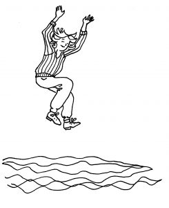
- Each chapter has one or two hand-drawn illustrations.
- There is a whole page with practical tips, which are organised with their own icons
The icons in particular often made us laugh. Monika and her husband have spent a lot of time abroad - which occasionally led to amusing new word creations. For example, Monika translated the word Icons ins German and always spoke of the icons for the book
The print set
 My hero is Gutenberg. When he invented typesetting, he wasn't just thinking about putting words on paper or parchment. He also considered how this could be done with the greatest possible aesthetic appeal. He wanted his Bible to be in no way inferior to handwritten Bibles in terms of beauty.
He developed special abbreviations, e.g. ß for sz, to fill the space in the justified text as evenly as possible. In addition, he developed the so-called "weft", which ensures that the lines on the back start at the same height as on the front. This prevents type from shining through unpleasantly in the lines in between. In his day, this was done with special frames and fixing pins that held the paper in position.
It's easier today. You no longer have to lay out and check printed sheets by hand, but can do a lot electronically. Nevertheless, a lot of precision work and meticulousness is required to ensure that the overall appearance of a book that also contains illustrations is coherent, that no lines overhang, etc.
My second hero is therefore Michael Zimmermann, who I have been working with for years. I'm always amazed at the details he sees - and I'm grateful to know that the finalisation of such a complex project is in his good hands - with everything that goes with it: typesetting, incorporating final corrections, sending the files to the printers, so that the end result is an all-round coherent book.


